Role:
Design Leadership
Platform:
Desktop / Responsive
Project Duration:
3 years +
Overview
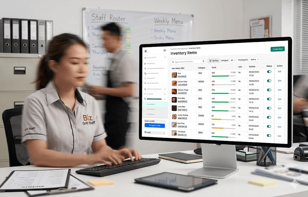
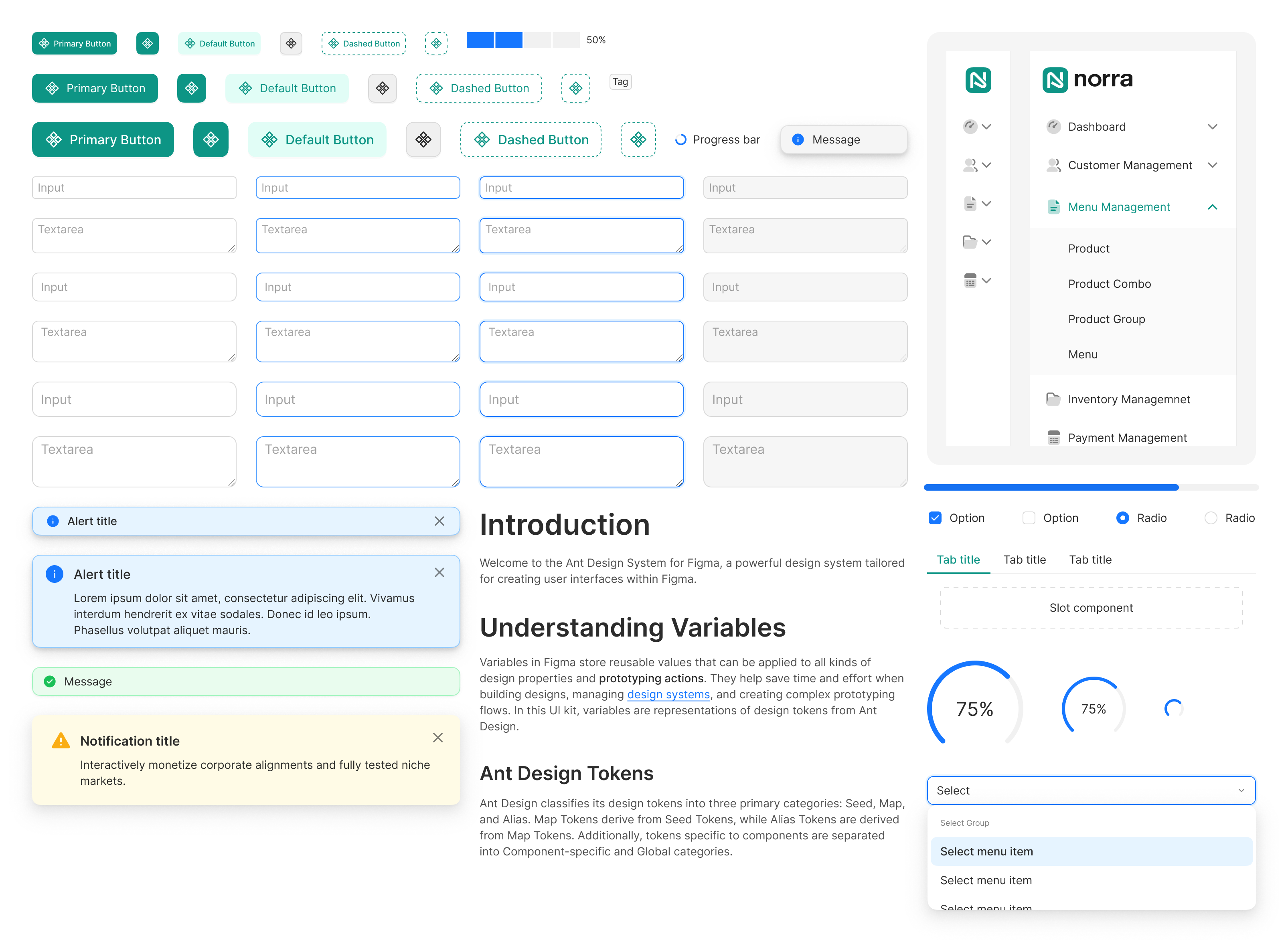
Built a design system on top of Ant Design for the Deliany restaurant ecosystem (later Norra.AI) — standardizing design language, naming conventions, and UI content patterns across 5 products. Result: reduced design time by 40% and developer component search time by 50%.
Problem & Approach
The Problem
When expanding from 1 to 5 parallel products — Web Order, Mobile App, Back-Office, Point of Sales, Kitchen Display System — three design/development language barriers emerged simultaneously:
- Ant Design lacks components for industry-specific scenarios (kitchen queue, cashier numeric keypad, etc.) → developers had to rebuild from scratch for each project
- No shared naming convention → designers called it "Dropdown" while developers understood "Select" → mismatch between Figma files and source code
- Ant Design's default interface copy was highly technical English, which did not suit real-world restaurant operators
Approach
Building a design language layer on top of Ant Design:
- Unified naming conventions from Figma directly to source code
- Self-serve documentation comprehensive enough to eliminate redundant questions
- Standardized UI copy patterns for critical user touchpoints
Constraints
- Only 1 designer (Quang) + 2 developers supporting component behaviors
- Must be applicable across multiple industries, not just restaurants
- Built strictly in Figma — not responsible for direct codebase implementation
Research & Analysis
Methodology
- Audited the entire Ant Design component library → identifying gaps compared to real-world requirements
- Collaborated directly with 2 developers to add custom component behaviors and align on names
- Reviewed default Ant Design copy → flagging confusing terms and context mismatches
Analysis
Key Findings
Evidence
Ant Design lacks components for restaurant-specific use cases
Developers had to rebuild from scratch on every project — zero reusability
No naming conventions → designers and developers spoke different languages
Occurred in Deliany Web Order — components built incorrectly due to naming confusion
Original UI copy failed to guide the next action
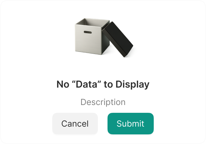
"Error", "No data" states failed to tell users what to do next
Content Solutions
Content Principles
- One name, one component: Consistent naming convention from Figma to source code, avoiding synonyms
- UI copy must guide the next action: Messages shouldn't just inform — they must tell users what to do
- Documentation must be self-serve: Complete enough for new members to search without asking
Naming Convention
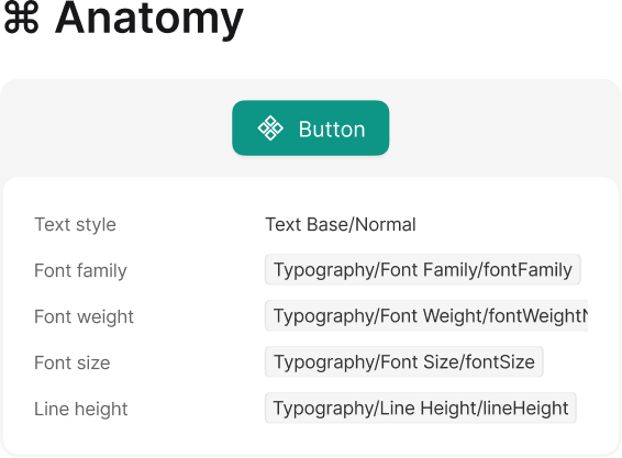
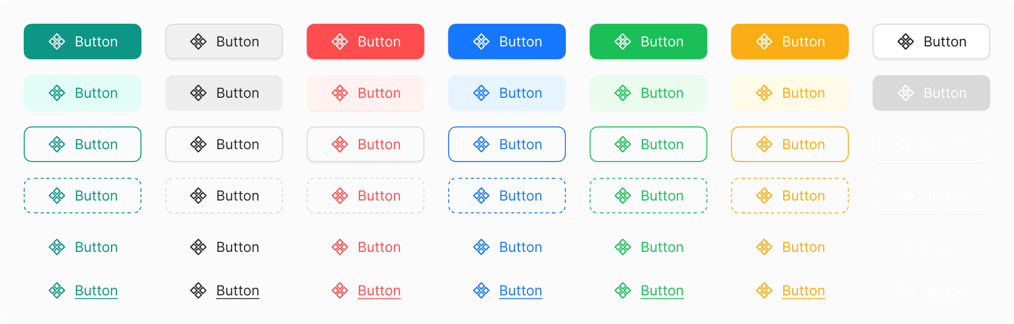
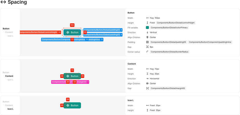
Standard format: [Type] / [Variant] / [State]
Component names remain in English to match the source code and the original Ant Design library.
UI Copy: Before & After
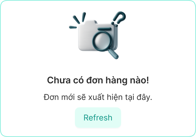
Scope of Work: Copy Templates Created
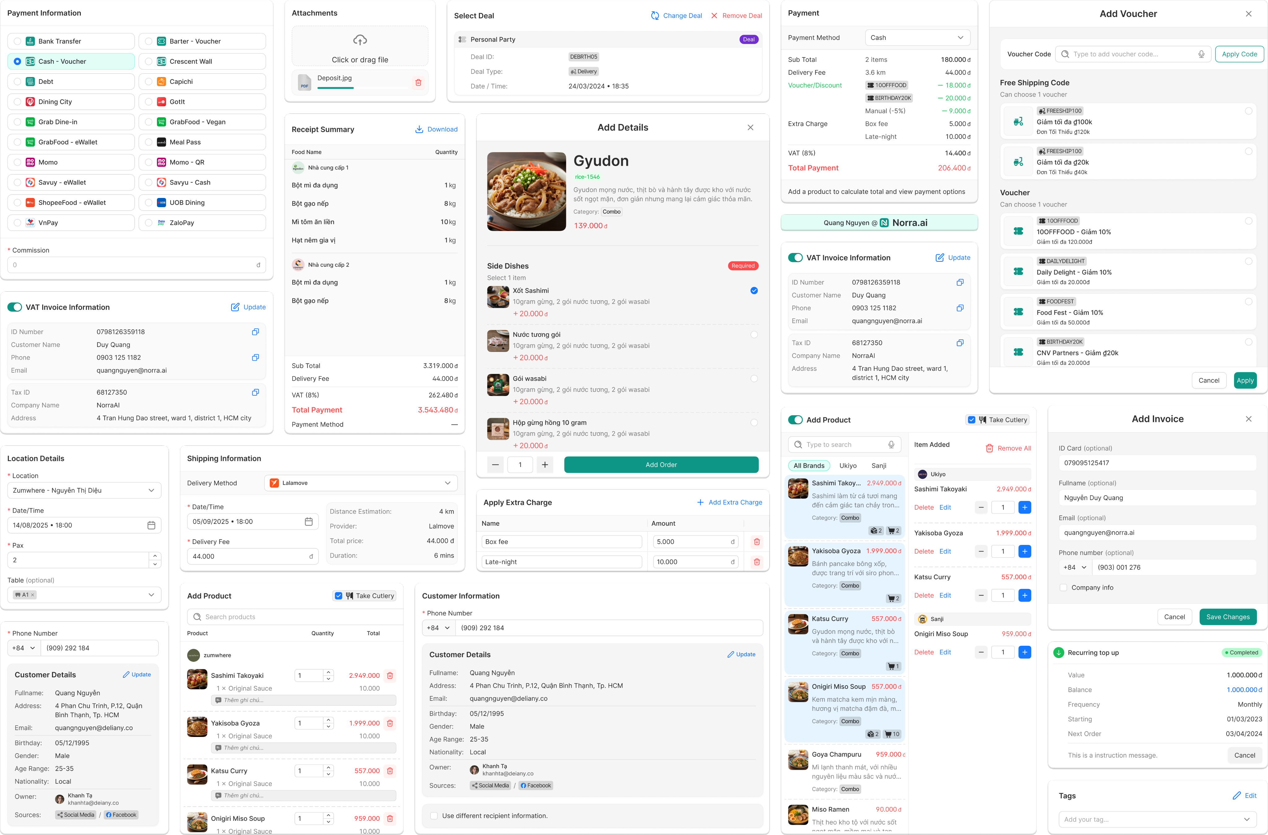
- Empty states: Empty lists, search results with no match, empty message center
- Error alerts: Form validation errors, system faults, network issues, permission errors
- Confirmation dialogs: Deleting records, cancelling orders, exiting without saving
- Toasts & quick notifications: Success / Warning / Error / Info banners
- Tooltips & helper copy: For complex features — priority kitchen queues, splits bill at checkout
- Loading states: Tailored by context — fetching data, processing payment, printing invoice
Testing & Iteration
Methodology:
Applied iteratively to each product, gathering feedback from developers after each release cycle
Adjustment Log
Results & Impact
Measurable Business Impact
Demo: Navigation Sidebar
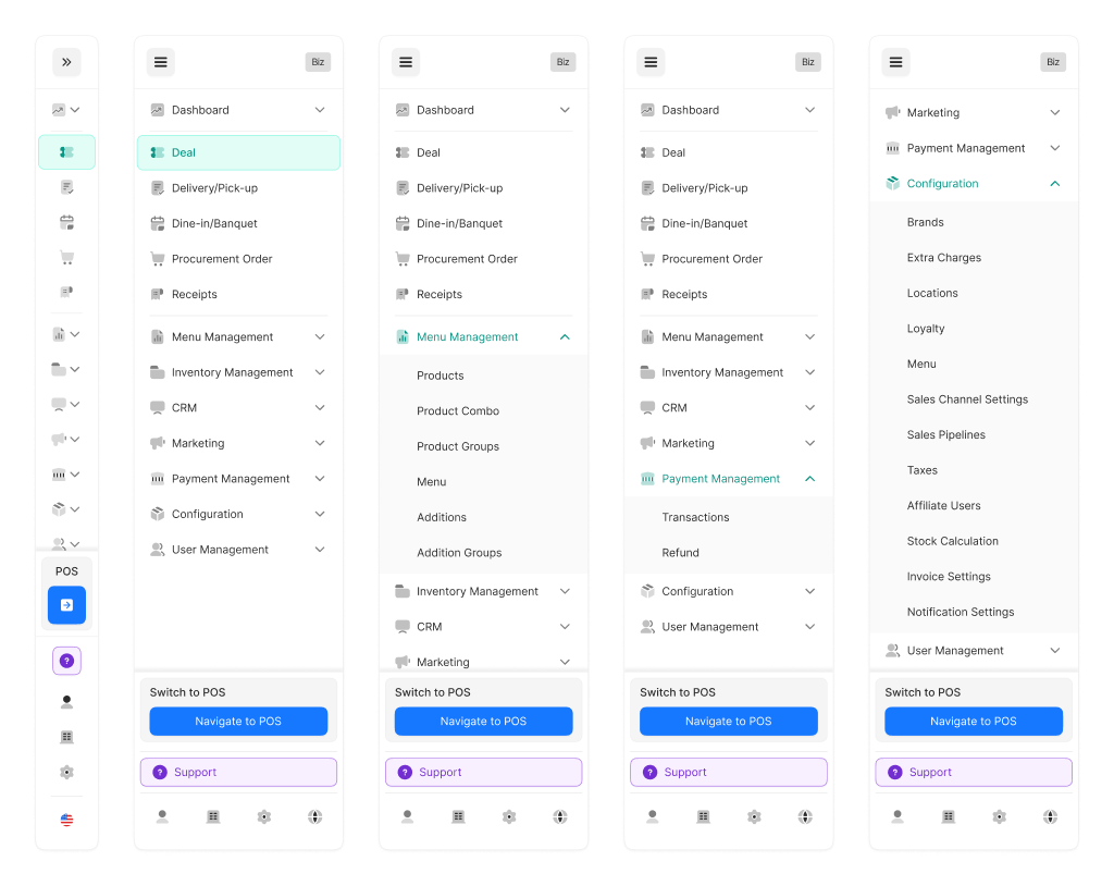
Interactive mockups of the custom Ant Design sidebar displaying its states: Collapsed, Deal active (teal active background), Menu Management expanded, Payment Management expanded, and Configuration expanded.
Design Language Impact
- Naming conventions established a shared vocabulary — eliminating misalignment between design and dev
- Copy templates helped new developers onboarding without constant questioning
- Usage guidelines removed repetitive decisions — instead of asking 'what copy for empty states?', a clear blueprint is ready
"Documentation doesn't need to be perfect from the start — it just needs to be clear enough to eliminate questions. I realized this after building Back-Office: we had docs, but developers still pinged me because we lacked concrete visual examples."